“From exploring new technologies and the greater galaxy, to artistic expression and spiritual reflection, intuitive ultra violet lights the way to what is yet to come.” This innovative and evocative sentence perfectly sums up why Ultra Violet is such a fantastic choice for Pantone Colour of the Year 2018.
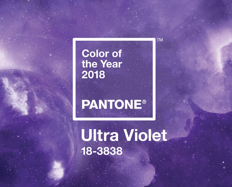
The official name of this shade is Pantone 18-3838 Ultra Violet. A dramatic and futuristic colour, that has beaten all rival colours to be crowned the Pantone Colour of the Year 2018. But what is the Colour of the Year and how does it come about?
What is the Pantone Colour Institute?
The Pantone Colour Institute is the leader in colour trend forecasting, brand colour development, custom colour solutions and more. It is a consulting service within Pantone. Recognised around the world as a leading source of colour information, these experts truly know their stuff.
They assist companies in making informed decisions about everything colour related – thus helping shape the world of fashion, beauty, interiors, and design. Creating unique colour strategies, these colour experts are sourced from around the world. Their unique and knowledgeable foresight in colour and trends, are what designers, editors, brands, creators, and makers look to for guidance and inspiration.
Remember that infamous scene in The Devil Wears Prada, where Miranda Priestly scoffs at the naïve Andy, giving an effortless but informative speech about how “Cerulean” (a kind of crystal clear sky blue) was a colour chosen by the people in that room, which fed through to every designer and high street collection that season? Well, you can bet your bottom dollar that cerulean came from the top colour dogs at Pantone. It did in fact. Millennium Cerulean Blue was the Pantone Colour of the Year in 2000.
How is the Pantone Colour of the Year Chosen?
“The Pantone Colour of the Year has come to mean so much more than ‘what’s trending’ in the world of design; it’s truly a reflection of what’s needed in our world today.” – Laurie Pressman, Vice President of the Pantone Colour Institute.
The Colour of the Year is a beacon of inspiration for creatives everywhere. The colour is not simply chosen by chance, nor by subjective individuals. As this colour plays a pivotal role in the world of trend and design, it needs to be thought out and decided very carefully, taking loads of points into consideration.
Pantone has crowned a Colour of the Year, every year since 2000. How do they choose them? The experts claim that the colours choose themselves. This 20 + person team – The Pantone Colour Institute – begins their global research early in the spring. They look for recurring patterns or colours in daily life, they look to politics and global situations, to unrest and cultural significance. The entire process takes nearly 9 months in total.
The Institute states that the Colour of the Year is actually; “…a colour snapshot of what we see taking place in our global culture that serves as an expression of a mood and an attitude.” For example, 2017’s Colour of the Year was Greenery – which stemmed from the turmoil of 2016; from terrorism and politics to natural disasters. The shade Greenery goes hand in hand with the idea of spring and rebirth – just what the world needed. It also connected with nature, and with our interest and passion in natural resources and sustainability rising, this really was the perfect colour choice.
What is Pantone 18-3838 Ultra Violet?
The colour must best represent the zeitgeist. It is therefore a very forward-thinking and complex decision, based on the mood, ideals, believes and events for both people and the world in general.
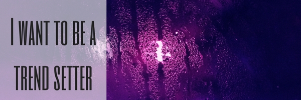
Every December, Pantone announces their Colour of the Year. For 2018, the colour of choice is Pantone shade 18-3838 Ultra Violet.
According to the Pantone website, Ultra Violet is;
“A dramatically provocative and thoughtful purple shade, PANTONE 18-3838 Ultra Violet communicates originality, ingenuity, and visionary thinking that points us toward the future.”
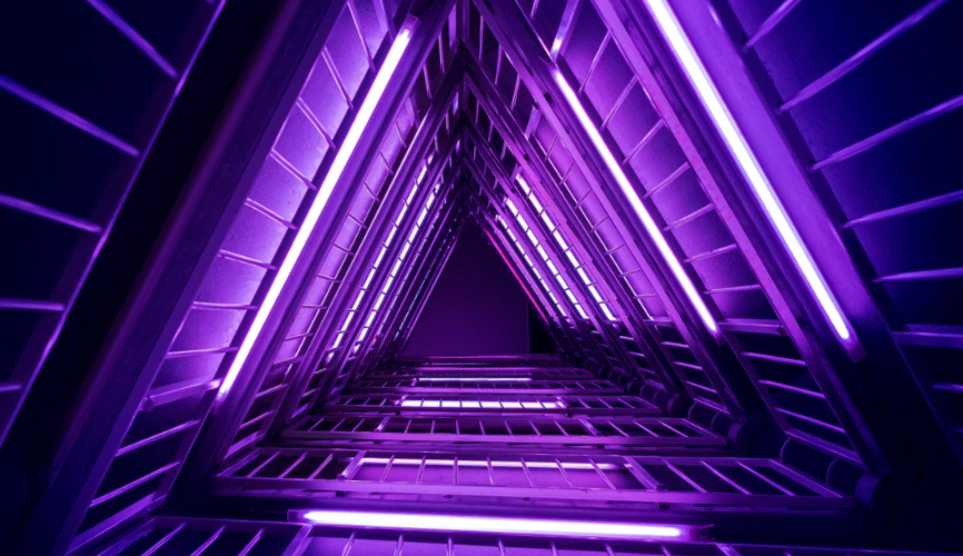
Indeed, the blue-based purple shade has a sense of futuristic, almost sci-fi influences, that makes you think of a bright future and the technologies that will get us there. It is an artistic and somewhat spiritual colour, that makes you think of a galaxy far, far away.
It is both intriguing and captivating, inventive and imaginative; A mysterious night sky, full of wonder, hope and optimism. There is also something of a spiritual quality attached to Ultra Violet. It is energetic and meditative, and full of life and wonder.
This is also a colour that we have seen in the cultural world, and it is connected to change, the unconventional, and creativity. Visionaries such as Prince, Jimi Hendrix, and David Bowie all brought aspects of this experimental colour into their work and their image, which shows the longevity and power of the colour. It is a non-conformist colour; unique and powerful, and one that pushes the boundaries.
Ultra Violet in Action
We are already seeing shades of purple, including Ultra Violet, in fashion collections and designs in all aspects of the design world. This jewel-like tone is rich and opulent and would make a fantastic focal point in a room or in a fashion range. It is dramatic and grown-up, but the blueish tone makes it a little more fun and daring. Used in the right amount, it can add heaps of character to your setting.
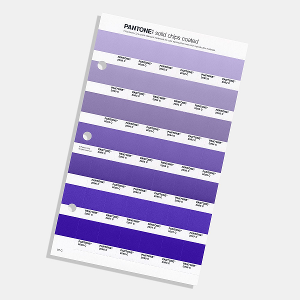
You can interpret Ultra Violet as a range of violet hues; ranging from soft and feminine, almost grey lavenders, to a deep and enigmatic purple. Opt for shades of rich plum and wine, to gentle lilac and lavender. It is said that violet hues are healing. They can help you stay calm, reduce high blood pressure, and calm the nerves. With that being said, this is a colour everyone should adopt in some aspect of their lives!
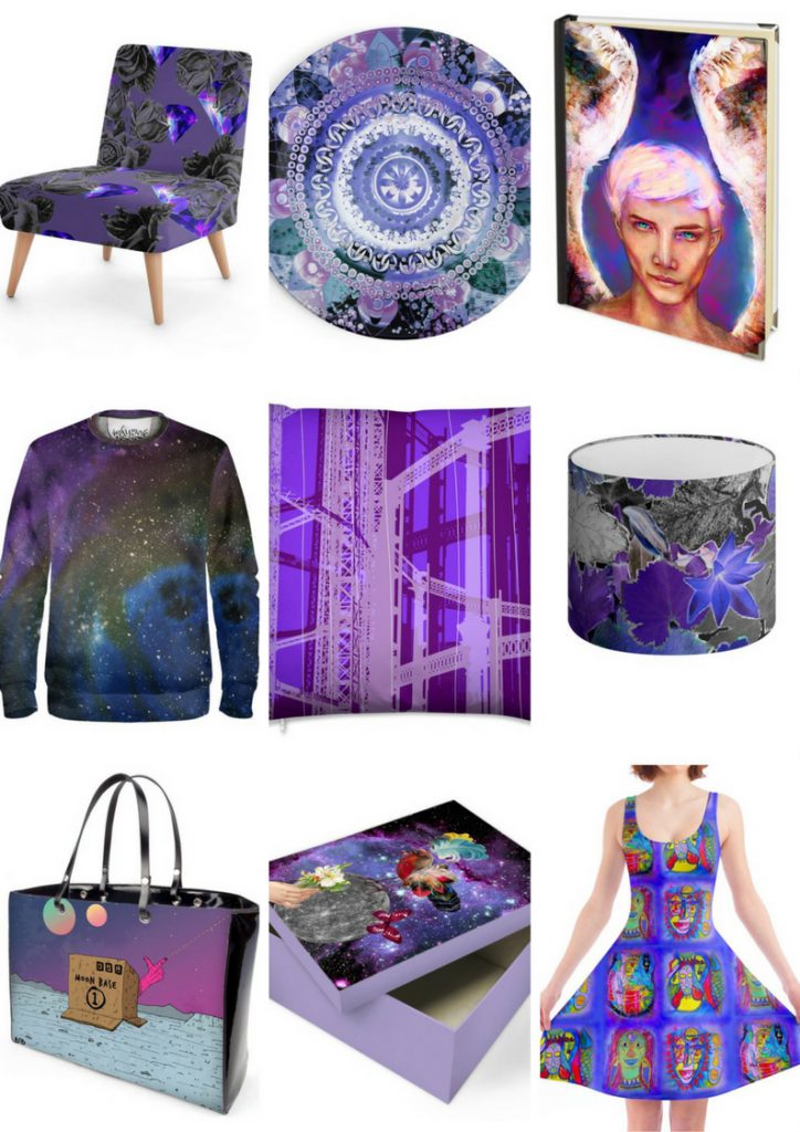
Contrado Creatives and Ultra Violet
We are very proud of our incredible market place of independent artists and designers, who we call the Contrado Creatives. These talented creators can make their very own online stores, showcasing their designs on our collection of handmade products and fabrics. It seems not only are they masters of their craft, but they are also visionaries and forward-thinkers, as many of them have adopted the Pantone Colour of the Year into their collections.
What do you think of the winner of the Pantone Colour of the Year? Is Ultra Violet a good choice? If you want to fill your home and wardobe with trendsetting pieces, created by artists with incredible talent and foresight, then click on the button below to visit our online marketplace. You will find an amazing array of fashion and homeware, that will push the boundaries and propel your style into the future…like Ultra Violet itself. Who knows. Who knows, we might already have a sneak peek at what the Colour of the Year for 2019 is…